I’ve been holding off on posting about our New Years invites because, frankly, I’m concerned that images won’t do them justice – but the time has come.
This year was our fourth year hosting a black tie NYE, and our third designing formal invitations. For a peek at years past, check out this post, and the portfolio.
We made as much work for ourselves as possible in the lead up to the holidays. The NYE invites are our fun project every year – no client opinions or budgets, no proposals or revisions, just the implementation of an idea – and though it’s a great opportunity for us to test untried techniques and learn a great deal, we tend to go overboard.
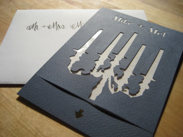
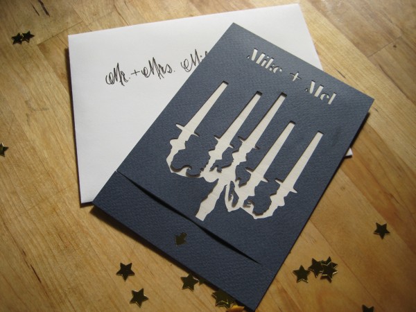
We were fond of last year’s cut candelabra design, and wanted to keep gold as our color of choice for all things festive. Having gained a familiarity with digital cutters, we thought, “What the heck?” and decided to cut each invitation with the names of the recipients. This meant that the design easily doubled as a holiday card; for family not attending our soiree, we cut “Happy Holidays” or “Merry Christmas” instead.
This year, we wanted something surprising, a party in a package. We talked through countless schemes and mechanisms – pop-ups, zipped pouches, pull tabs, threads – and one day on a run (when I, for one, do my best thinking) settled on something much simpler.
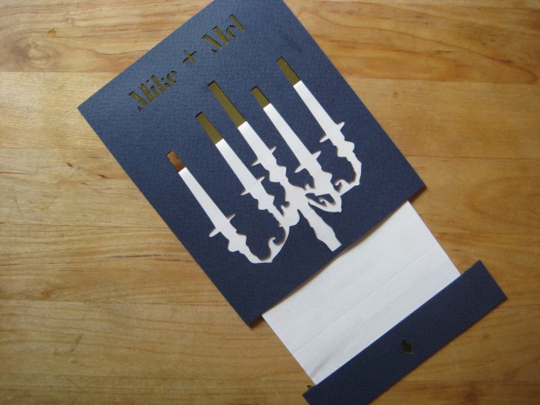
Nestled between bristol board in midnight blue, a folded white insert housed event details and gold confetti. When removed, the insert both revealed gold through the cut names and candelabra, and unfolded backwards to dump confetti with minimal warning. (The messages we received regarding confetti all over floors, cars, pets and laps were a hoot – had we gone with glitter as initially conceived, we might not have kept our friends.)
On the inside of the front cover, we included a backing of acetate to provide a surface to attach the prongs of the cut candelabra, and to protect the cutting from damage as the insert was removed and replaced.
The insert itself was anchored in the pull tab, which was assembled in layers matching those of the main card. The thick edge of the tab prevented confetti from freeing itself prematurely, and ensured that the card would feel even when fully assembled.
We retained the Union Jack Creative logo on the back of the pull tab – it just looks so darn cute in dark cutouts.
I’m not quite sure what we’ll do next year, now that everyone is expecting the unexpected. Friends whose floors we confetti-bombed: please don’t leave us?


Pingback: Union Jack Creative – Festivities and Photo Booths
Gorgeous invites! The photo certainly does do them justice!
Pingback: Union Jack Creative – Black Tie Affair: New Years Eve 2013