


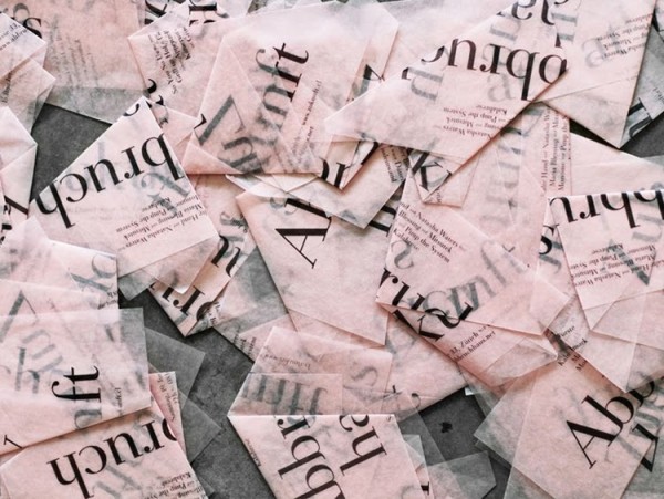
One of the many projects of the summer, Issue 5 of Don’t Take Pictures has gone to print and is available now! Once again, we took on the print layout and design for the biannual photography journal, and found that the influence of trending blush tones can be seen in this issue’s cover, too. Per usual, the photography featured […]
Author Archives: Kate
22
Sep
Sep
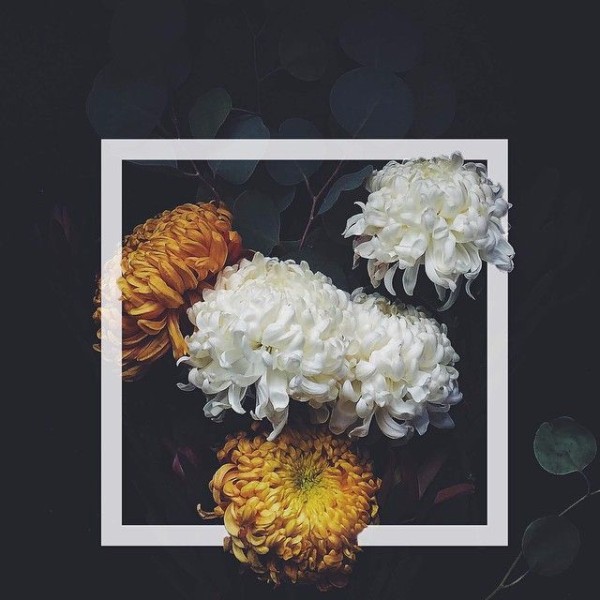
We’ve spent our summer season treasuring every light, airy moment we could get, and we’re not alone: pale palettes, and especially pinks, have been infiltrating our feeds as blush takes hold as an accent color playing well with warmth, and having staying power and formality when paired with whites, greys, black and gold, too. We’ve loved seeing watercolor […]

13
May
May
It’s finally warmer outside, and work of a less creative persuasion has picked up accordingly – we’ve been planting and patching and repairing winter’s damage, but we fit a quick trip to Miami in before things picked up, too. Here’s what we’ve been up to! 1-Home Depot runs in a Miata include mulch behind the driver seat; 2-House […]

03
Apr
Apr
Marathon Monday has always been a key marker of the change of seasons for us: sure, it can snow in mid-April, or be blustery and rainy and miserable, but no matter the weather on the actual day, it’s an indication that we’ve collectively made it. Whether as a runner training through winter and finally arriving at race […]
01
Apr
Apr
It’s Spring, it’s April – and it’s still brisk and cool in Boston. The snowbanks are receding, though, and a few brave daffodil sprouts have broken through in our front yard; we’re looking forward to the coming changes in our dreary landscape! Even as we’ve begun to narrow our focus to the colors we really […]

24
Mar
Mar
SheFinds asked us for our advice to brides hoping to use Etsy to source their wedding – how to streamline and simplify, and how to keep the stress low – and our tips along with others’ are on the site today! We had more to say than the piece called for, so here are a […]
23
Mar
Mar
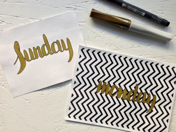
The only way to improve skills, especially when using new tools, is practice – but I still sometimes have a hard time “wasting” paper to test our press or practice letters. That’s how Monday ended up on a pressed black zigzag when I wanted to play with a gold Kuratake brush pen this morning, admittedly lending […]

20
Mar
Mar
It’s officially Spring! And it sure doesn’t feel like it here. But, never mind that. It’s Friday, too! I did a bit of doodling over lunch, inspired as I always am on the first day of Spring by a jazz standard, and inspired typographically by a lovely letter from Joshua Phillips that was circulating Pinterest. Spring: […]

18
Mar
Mar
Another issue of Don’t Take Pictures is available! Issue 4 is our fourth layout for the biannual photography journal, available in print and online, and includes a reworking of the original DTP logo with a serif font. We began our work with DTP on Issue 1 in 2013, developing the brand and layout for the journal […]
09
Mar
Mar
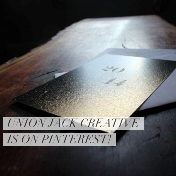
It’s official: Union Jack Creative is now on Pinterest. Jack and Kate have been using the platform for years to collect ideas and inspiration and to help translate clients’ visions into custom designs, but as we shift our focus it finally became worthwhile to have a UJC-specific account that stands alone, without house projects, style […]