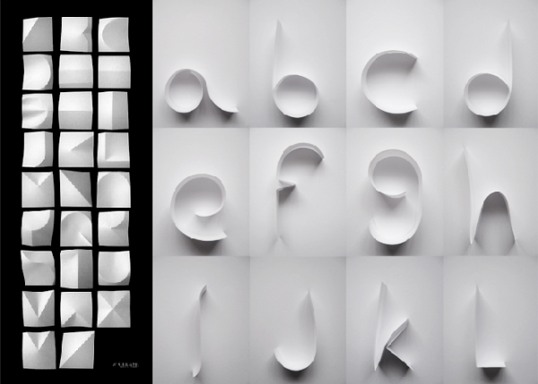
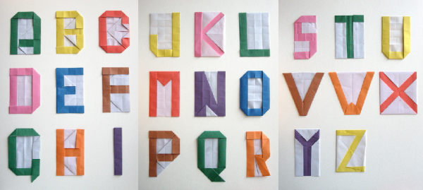
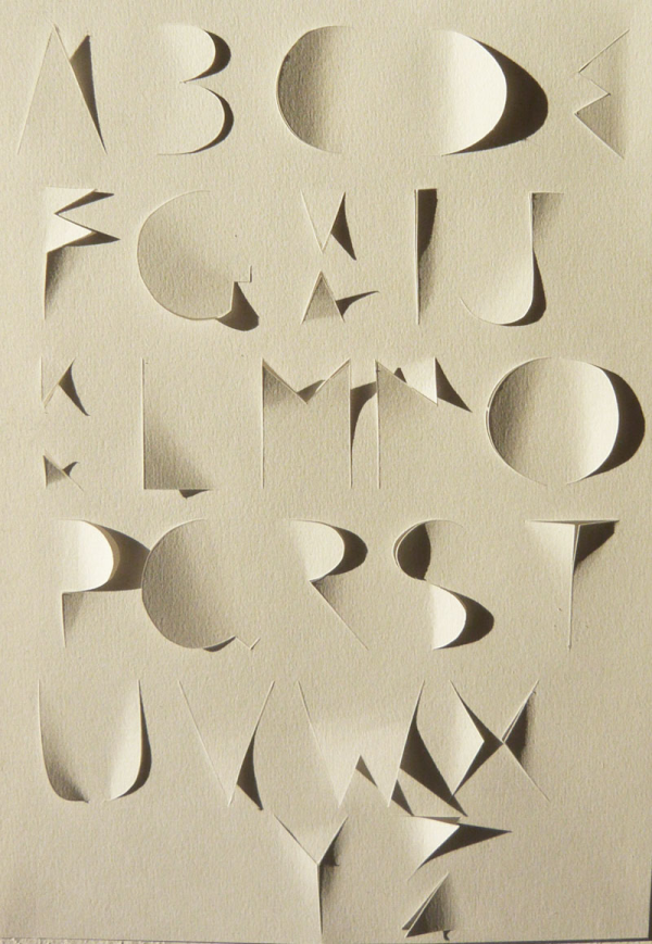
We try to keep tabs on type, to spot trends, find inspiration and sometimes just for practice. One particular typographic feat has been catching my eye lately more than usual, and it’s the cutting, folding, layering, lighting and other assorted manipulation of paper itself to form letters.
We’ve looked at Lo Siento’s faceted EMPO branding before, and at Tony Ziebetzki’s scanned type alphabet—but here are a few recent favorites. Click through for more work from these talented folks!
image credits: 1-Lobulo Design, “Atype”; 2-“Crease,” via Good Typography; 3-Justine Sutton, “Limitations”; 4-Atelier pour enfants, “alphabet en origami”; 5-Oeilbleu, “alphapapier”


