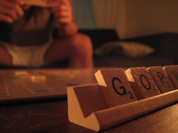
Years ago, when Jack and I first got together, we bonded over a love of Scrabble. Our games would drag on for hours – I would occasionally doze off waiting for my turn – so I eventually bought a travel version that could be packed up with letters still in place, to be continued by the light of the next day.
Our first real fight was over a Scrabble game, too. (Here’s the thing – Jack is next to impossible to beat. In a fatigue-fueled act of desperation I may have tried to, um, bend the rules in my favor.)
Between us, we own at least two Scrabble sets, and of course the official game dictionary. We haven’t had much time for hours of linguistic gaming lately, and Words With Friends is a sad replacement for the late, great Scrabulous – but we were smitten with this minimal, typographic take on the classic nonetheless.
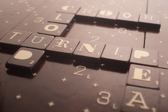
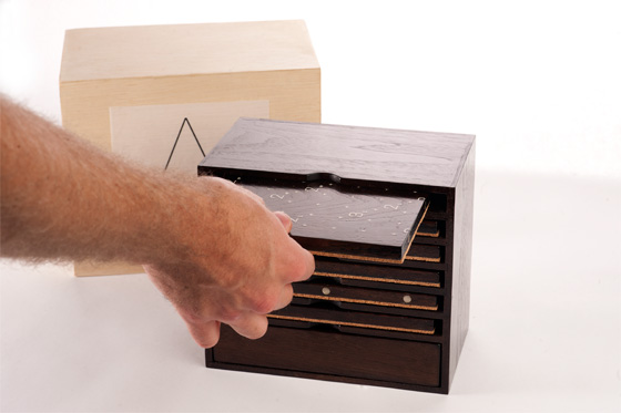
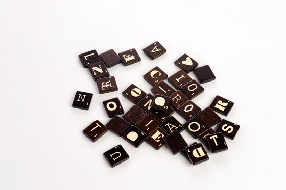
Andrew Clifford Capener worked on this updated Scrabble design, featuring a magnetized walnut board and walnut tiles in a selection of fonts. The design is minimal, the storage system is elegant and we have weaknesses for walnut, word games and typography. Perfect!
Sadly, the limited run has already been sold out, but sign-ups are still open for the waiting list, just in case.
You can find a full interview about the project over at The FontFeed, or head to Andrew Clifford Capener’s site to see more of his work.
image credits: 1-Union Jack Creative; 2,3,4-Andrew Clifford Capener


