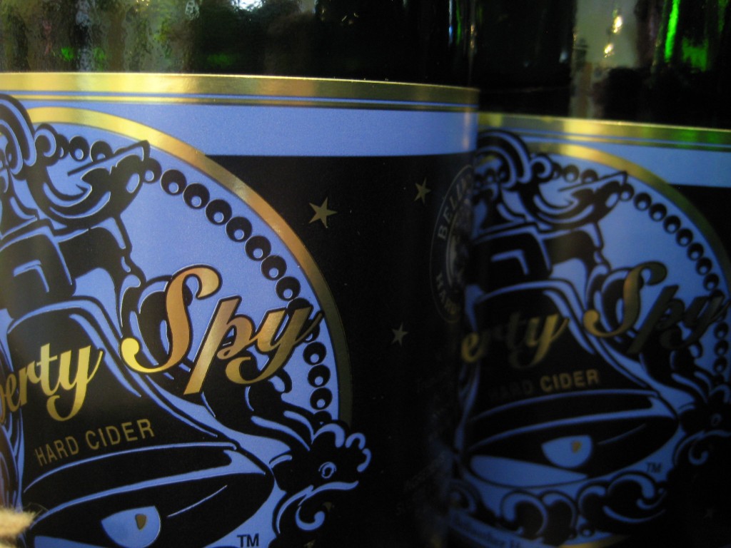
We did some wine tasting this weekend in the Finger Lakes region of New York with family, and made a stop at Bellwether Hard Cider in Trumansburg. We expected the cider to be on the sweeter side, and were pleasantly surprised to find much drier offerings. A bottle may have been purchased to allow for mimosas the following morning…

What struck me most, though, was the label designs at Bellwether. So often, labels on wines are an afterthought. Jack and I, like everyone, sometimes need to choose a last-minute, unfamiliar wine in the liquor store based solely on the appearance of the bottle – not ideal, but it happens. Of course, design costs money, and smaller vineyards have to prioritize somewhere; frequently, labels are not that priority. Some are just boring, and others are downright bad, with the worst offender this weekend being a vineyard featuring some rather excellent wines wearing a pixelated, low-quality graphic. For shame!
And so, these sleek, vintage-inspired cider labels at Bellwether were a welcome surprise from a small operation. Their priorities clearly lie in favor of attractive packaging, and as their ciders themselves are just as surprising, I hope that their decision to play up the labeling pays off!


I like that their very consistently branded from cider to cider — distinct enough to quickly differentiate, but easily identified as “Oh yeah! that’s the cider I tried up in NY. I should buy it again!”
…and I was hoping for the sweeter ciders we didn’t find, but the mimosas were quite tasty. If only every breakfast could start the same way.