

A little while back, I had the pleasure of stopping by Moo’s Boston offices with Elizabeth for a Design Museum Boston panel. It was a delight.
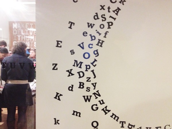
One of our favorite features, though, was the use of letters as decor, and in the shape of the Moo teardrop logo.
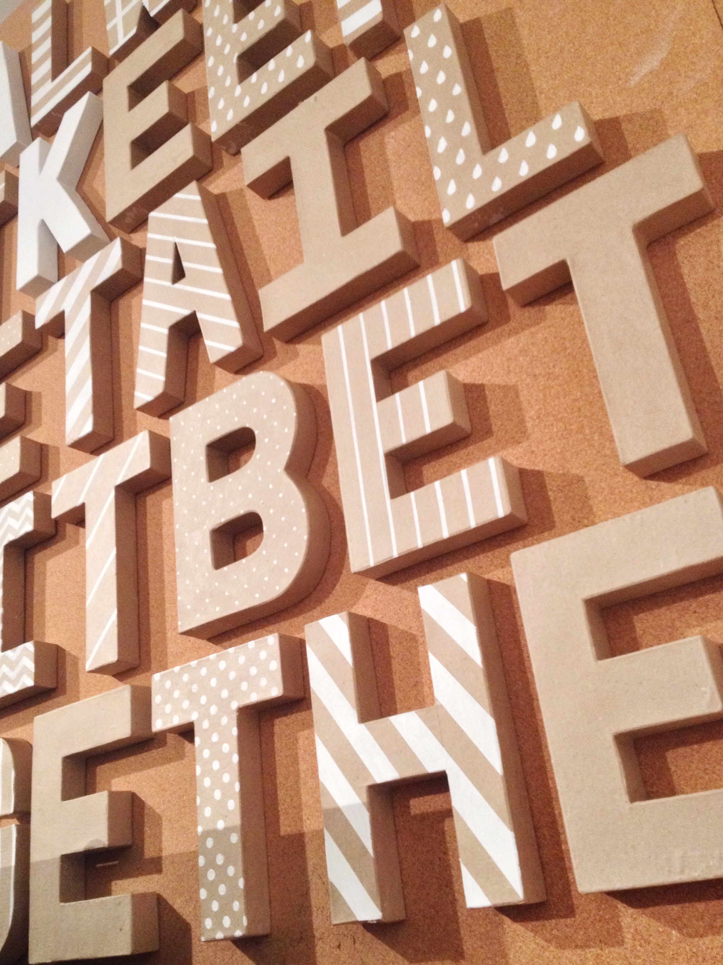
The black serif type carries across the conference rooms, with neat, orderly lines of letters spilling into the teardrop shape in negative wall space, and the block letters in three dimensions provided some depth in the thoroughly modern workspace.
(Plus, I’m a sucker for good wood floors.)

Many thanks to Moo for sharing their space, and letters-as-decor, and to panelists for sharing their industry insights!
image credits: Union Jack Creative
Pingback: Union Jack Creative – Friday Fancies