A few weeks back, when Cee Lo Green leaked an unofficial, typographically animated video for his latest track ahead of the official release, it quickly made its rounds about the blogosphere. (We personally, even after the official video release, are partial to the typographic version.)

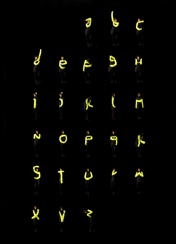
As the video was blogged, reblogged, linked and shared all across the internet, we got to thinking about typographic animation – motion typography or kinetic typography, as it were – and as it turns out, Cee Lo was far from the first to put type in motion. We spent some time looking into other artists’ explorations of moving type – what follows are some of our favorite interpretations. (image credit: Amandine Alessandra)
The music video for El Cuarteto de Nos’ Ya no sé qué hacer conmigo is strikingly similar to Cee Lo’s video in its use of color, but the movement of text and integration of graphics is far more complex. Don’t get too caught up in trying to understand the language; the piece is visually engaging enough to hold your attention for the duration, and through a second viewing. Do watch twice – it moves quickly, and you’ll catch some details you missed on the first go.
In The Child, a video created for French DJ Alex Gopher, Antoine Bardou-Jacquet constructs a world entirely out of text. Fonts and language vary, adjectives are employed heavily and ultimately the story is conveyed without the use of images. This, too, is worth a second watch – keep your eyes peeled for cheeky details that slip by on the first viewing.
Rather than rely on text to help the viewer identify worldly objects in his alternate universe, Canadian designer Olivier Beaudoin utilizes the shapes of type in his construction. Typolution (set to one of our favorite Ratatat songs) explores the creation and subsequent destruction of a world generated entirely through typographic shapes.
London-based designer/photographer Amandine Alessandra explores type in motion from a much different perspective in her Letterform for the Ephemeral project. Models dressed in black and neon are photographed against a black background to form letters through the contortions of their bodies. More of Amandine’s typographic explorations can be found in her portfolio. (image credits: Amandine Alessandra)
What do you think? Do you have any favorite examples of type in motion?


I think the Beaudoin piece is great. I particularly enjoy the 3-D effects, moving through space as things sprout out all around. Thanks for sharing.