

Much like the Mother’s Day mum cards, we decided to make some punny pops cards in the knick of time for Father’s Day.

The classic soda bottle silhouette was a much simpler concept than the pinpricked mum from the very beginning, and the process ended up being much quicker – which was good, since we hadn’t started these before our trip and had only one night to design and assemble if we wanted any hope of mailing them in time for Sunday.
So, what was our method?

The process once again began with a Google image search. I found a basic image of a classic, glass soda bottle that would be easy to work with, and handed it off to Jack to work some vector magic. He loaded the image into Illustrator, and we decided which curves to emphasize in order to keep the iconic form intact. We then duplicated the stripped-down form, copied it to add a second bottle (primarily because I liked the sound of the plural “pops” better than the singular) and made a few adjustments so that the shapes would be easier to cut and would allow the card to remain intact.
It’s important to note, if you decide to make your own, that skill in Illustrator is not a necessity – you could certainly create a stencil by hand, directly from an image. Jack’s talents, though, made it much easier to play with layout and make adjustments.

Once we were happy with the soda bottle shapes, we checked our stash of cardstock – since it was already midnight, there was to be no shopping for project specific paper – and found that the only stock heavy enough to withstand the detailed cuts was 9″x12″ bristol board. Wanting to stick with the quarter-fold design that would fit into the last of our New Year’s envelopes, we laid out the templates to fit two on each sheet.
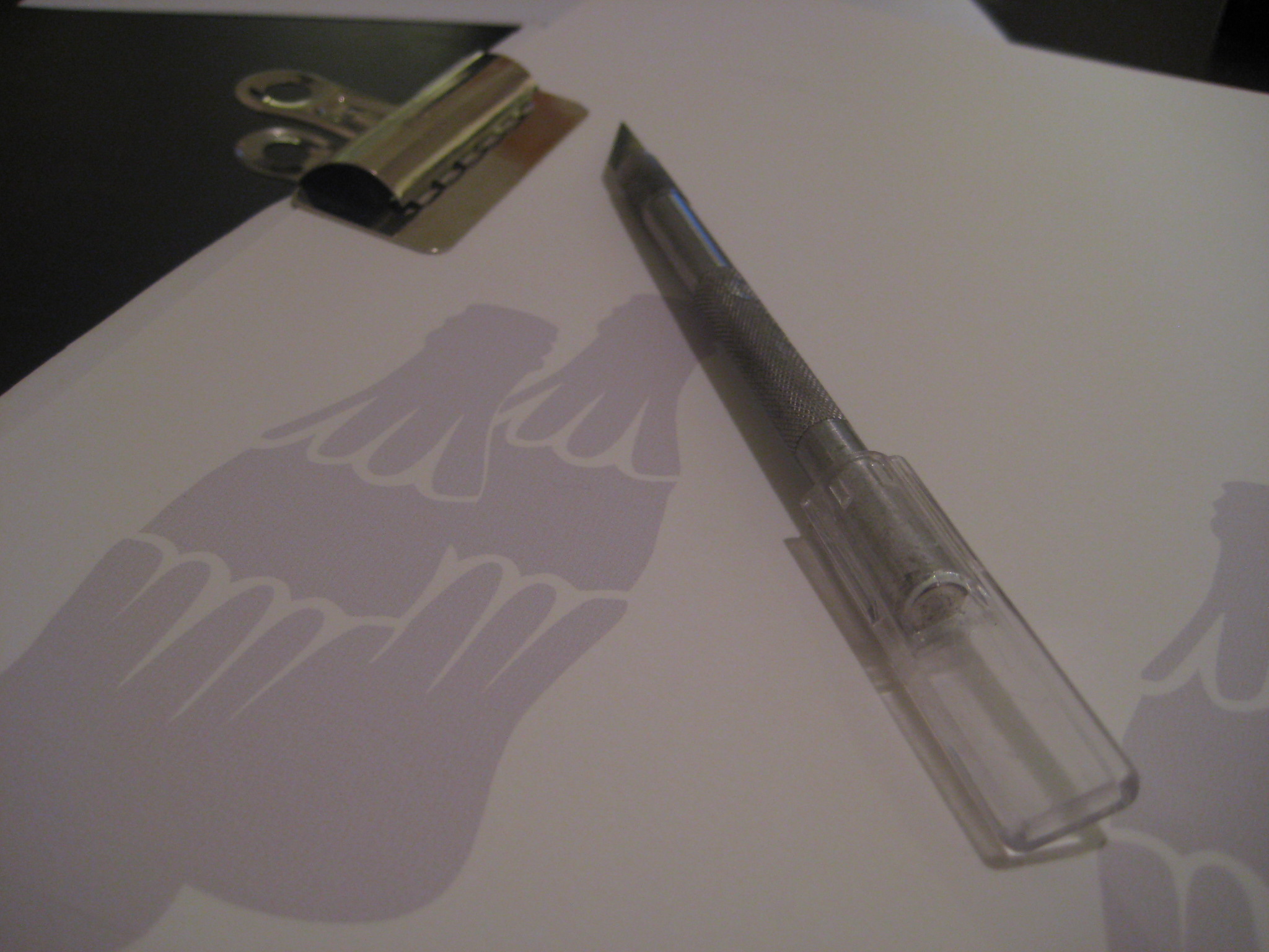
Once laid out and sized correctly, templates were printed in a light grey (so that I could see what I was cutting), and I clipped each sheet snuggly to a previously-read magazine. Of course, if you have a cutting mat at your disposal, that would be ideal – I did not, and the magazine was sufficient.

After cutting each of the four templates, I used a paper cutter to cut each sheet in half (yielding two cards per sheet), and lightly scored the spine of each card with my exacto knife to allow for a crisp fold. Since of course we wanted to write a note in each card, the cut sections needed a backing to prevent text from showing through the front. I flipped through an old issue of Elle Decor, pulled out a few pages of wall covering advertisements with enough patterned space sans text to fill the soda bottles, and trimmed them to fit. Using rubber cement, I affixed each pattern clipping to a thin piece of cardstock cut to size, and then glued the whole thing to the interior frame around the cutout.
A few tips:
- Always use a very sharp, very new blade to do detailed cutting work – even if it seems the older blade has plenty of life remaining. Your cuts will be cleaner, you’ll have more control and you’ll be less likely to cause tears in corners or of fine sections. I used two brand new blades for these four cards.
- Don’t remove cut sections until you’ve completely finished cutting. Leaving the already-completed sections in place while you cut the remainder provides support and stability, makes subsequent cutting easier and prevents tearing.
- Don’t hesitate to print your design on regular paper first, and give it a shot; testing out your design by hand will give you valuable insight into the physics of the project and help you know if your concept is utterly impossible to cut.
- Rubber cement was excellent for this project because I could rub off any extra once it had dried, to keep everything crisp and clean. If you’re using other glue, be very judicious in your application – you need to be sure to secure fine cuts for stability, but you don’t want glue smooshed out around the edges.

I placed each card, folded and glued, under a few books overnight to make sure everything would stick and nothing would wrinkle. Come morning, I lettered each with “pops” on the cover, and “happy father’s day” inside before writing an additional note in each, popping them in envelopes and dropping them in the mail. These cards were much more approachable than our Mother’s Day venture, and we’ve got a few more punny papercuts in the works – stay tuned.
What do you think? Have you ever done a project like this, or would you give it a try? Did you send cards to any of the men in your life this weekend?
Pingback: Union Jack Creative – The Charles to My Ray