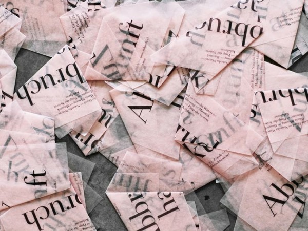
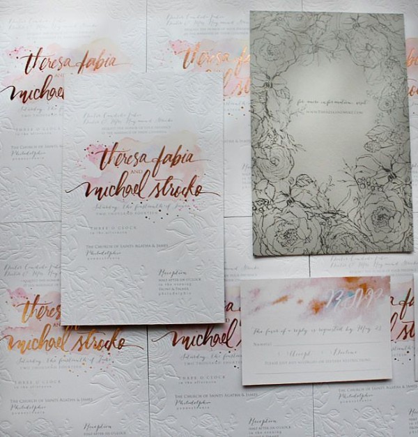
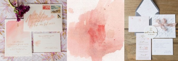
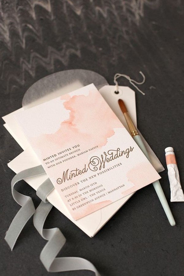
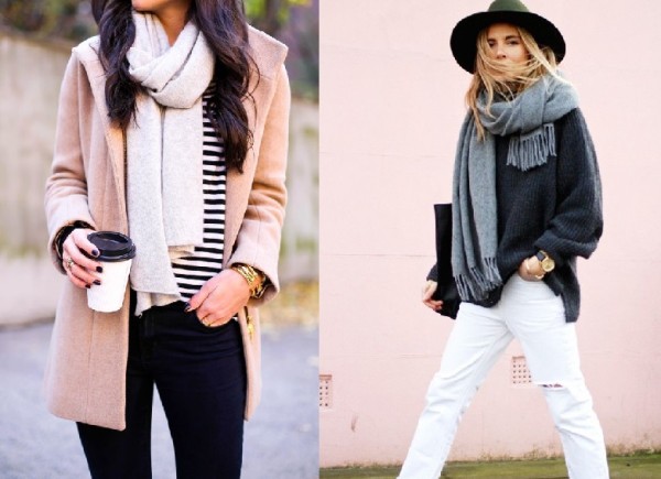
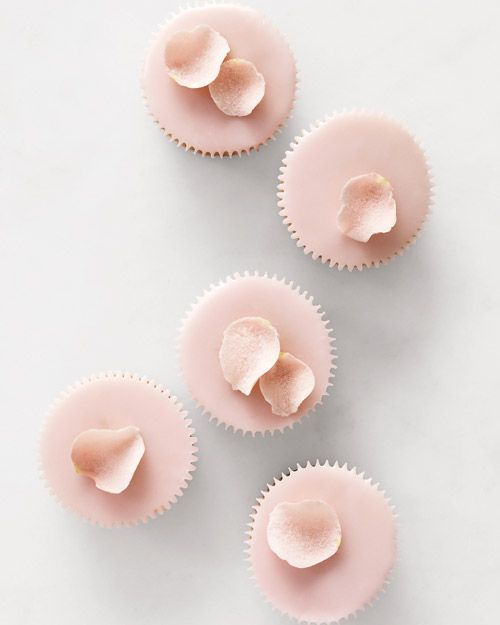
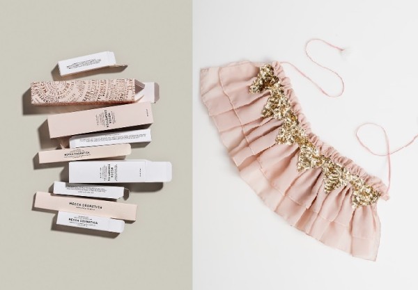
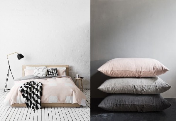
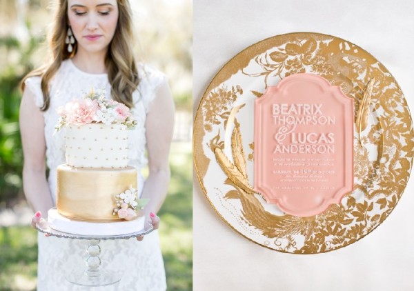
We’ve spent our summer season treasuring every light, airy moment we could get, and we’re not alone: pale palettes, and especially pinks, have been infiltrating our feeds as blush takes hold as an accent color playing well with warmth, and having staying power and formality when paired with whites, greys, black and gold, too.
We’ve loved seeing watercolor stationery themes take on this tone – it lends itself so well to a swirling, background depth that still allows blind pressing, gold or hand-lettering to shine. The delicate pink brings a current touch to classic, calligraphic designs, and a soft elegance to bold, type-heavy layouts.
Blush tones have been been working their way into homes, fashion, packaging, weddings and events, too; since they’re just a step or two from neutral beiges and greys, blush colors are an easy transition for those of us who have long preferred the monochrome.
We’re looking forward to combining this shade with gold, black and dark grey to bring a bit of warmth into fall as we transition. Want more inspiration in blush tones? We’ve got a Pinterest board for that! What are your favorite picks in pale pink? Share them with us!
image credits: 1-Tiziana Tosoni, via Pinterest; 2-Monumental Designs; 3-La Coquette Miserable; 4-Green Wedding Shoes; 5-Francois Henri Galland, via Abundance; 6-Style Me Pretty; 7-Pen & Peplum; 8-Want That Wedding; 9,10-Team Impression; 11-BRIS, via Behance; 12-With Love From Kat; 13-via Pinterest; 14-Martha Stewart Weddings; 15-Mecca Cosmetics, via Good Design Makes Me Happy; 16-Covet+Lou; 17-ShowHome.nl; 18-Studio Oliver Gustav; 19-Style Me Pretty; 20-Southern Fried Paper

