This weekend, the sun shone – and it was warm. Very warm.
(A quick aside: I’ve only recently come to realize that many people don’t understand why this turn of phrase makes sense. This, to me, is strange, because it always seemed so obvious. Interesting.)
Jack was out and about for a work conference on Saturday, and a class walking tour on Sunday; I occupied myself with a long run and a lettering project.
A coworker recently approached me about lettering placecards for a graduation party; I was of course eager to put together a proposal.
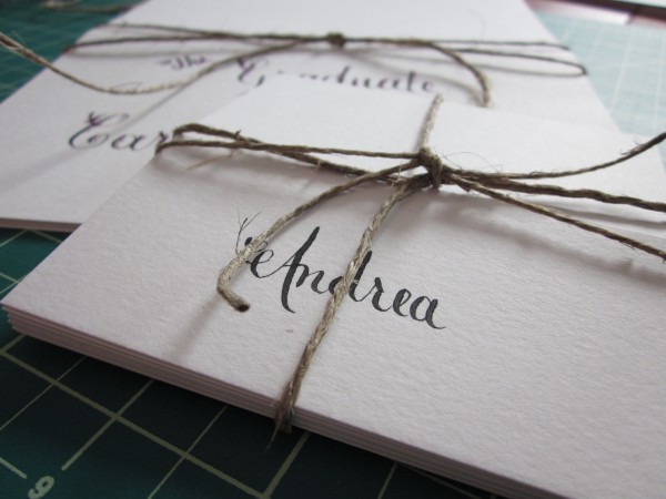
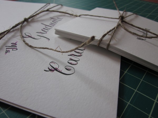
The final product includes larger “title” cards and group placecards, as well as a handful of individual placecards.
The stock is a bright white bristol board, with a slight texture along the grain. I lettered first names only to lend a more casual feel to the formal copperplate script. Each card was scored lightly to allow the cards to fold into free-standing tents neatly.
Since the flowers at the party will be pink, Maria requested pink accents on the title card of the guest of honor; having liked a sample I had shown her featuring the dot accents, and wanting to keep things tending toward the casual while still using the formal script, we opted for pink dots here.
Having not had much time to seek out lettering work lately, this was a wonderful chance to pull out my pens. Thank you, Maria!

![IMG_0854[1]](https://unionjackcreative.com/wp-content/uploads/2011/07/IMG_08541-600x600.jpg)


