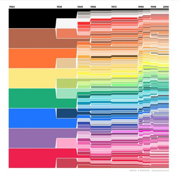
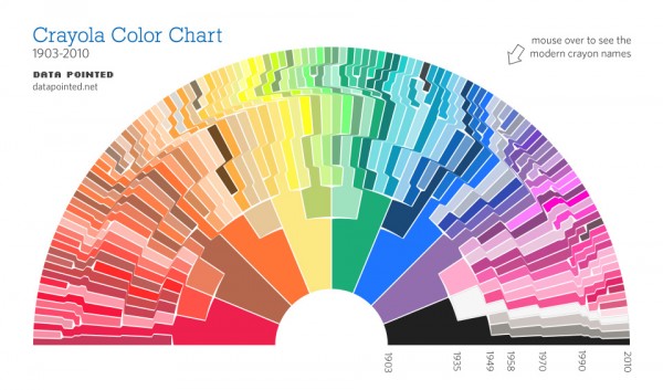
Infographics are fun things; one that is well-designed can portray complex data in startlingly simple terms.
We enjoy a good infographic, and we certainly have expressed our love of crayons here before. Data Pointed’s Stephen Von Worley helps bring these disparate affinities together with a visual history of Crayola’s colors.
It’s true, this chart is not brand new – Von Worley’s pseudonymous friend “Velo” created the chart in early 2010, matching Crayola’s published lists of colors with hues to be displayed chronologically.
Later last year, the duo decided to tackle a reformulation; though I’m partial to the square version, the arc does make more recent colors more readily visible, and the added functionality of color names being displayed with a mouse hover is great fun.
Click on the image to head to Data Pointed and play around with the chart for yourself! If you have a few minutes, be sure to read Von Worley’s creation myth for the infographic, for a bit of background.
Do you have any favorite infographics? Perhaps a favorite Crayola color? Do tell!
chart credits: Data Pointed


